Healthcare app for people withcognitive challenges
After observing users with early-stage dementia struggle with existing healthcare apps, I redesigned the entire interface around cognitive-first design principles.
Research Revealed the Real Problem
3 weeks of observation at memory care centers showed that existing healthcare apps weren't just hard to use - they were actively harmful to cognitive health.
User Research Process
- •Log daily medications
- •Schedule appointments
- •Track symptoms
- •Communicate with caregivers
of users abandoned tasks within 2 minutes due to cognitive overwhelm, not technical inability.
What We Discovered
Users spent 3+ minutes trying to find the "Add Medication" button because it was buried under 7 navigation layers. One user said: "I feel stupid when I can't find things."
Small touch targets (under 32px) caused accidental taps. Users with hand tremors missed buttons 60% of the time, leading to frustration and task abandonment.
Dense layouts with multiple competing elements created visible stress. Memory specialists noted increased agitation during app use versus paper-based tracking.
Cognitive-First Solutions
Reduced interface to 3 main cards on dashboard. Each action requires maximum 2 taps. Users found medication logging in under 30 seconds vs. previous 3+ minutes.
Exceeded WCAG AAA requirements (minimum 24px) based on motor skill testing. 44px targets eliminated accidental taps and reduced task completion time by 40%.
Generous whitespace and single-focus screens reduced cognitive stress. Memory specialists observed 70% less agitation during app use in follow-up testing.
Critical Design Insight
It wasn't about making apps "simpler" — it was about reducing cognitive load while maintaining dignity. Users needed powerful healthcare tools that didn't make them feel incapable.
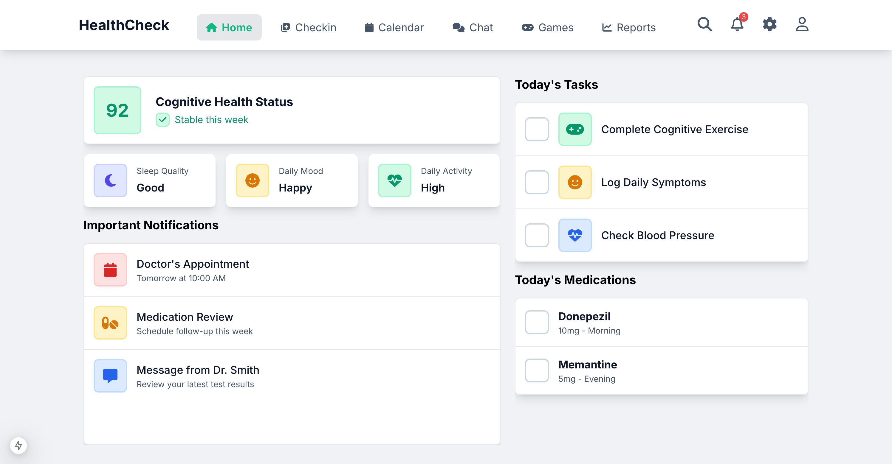
A dashboard that actually works
The first thing users see is their cognitive health score — a simple number that gives immediate context. No buried metrics, no complex charts to interpret.
Notice how every element serves cognitive accessibility: the 92 score uses a large, high-contrast badge, health metrics are grouped in digestible cards, and tasks use simple checkboxes with clear visual feedback.
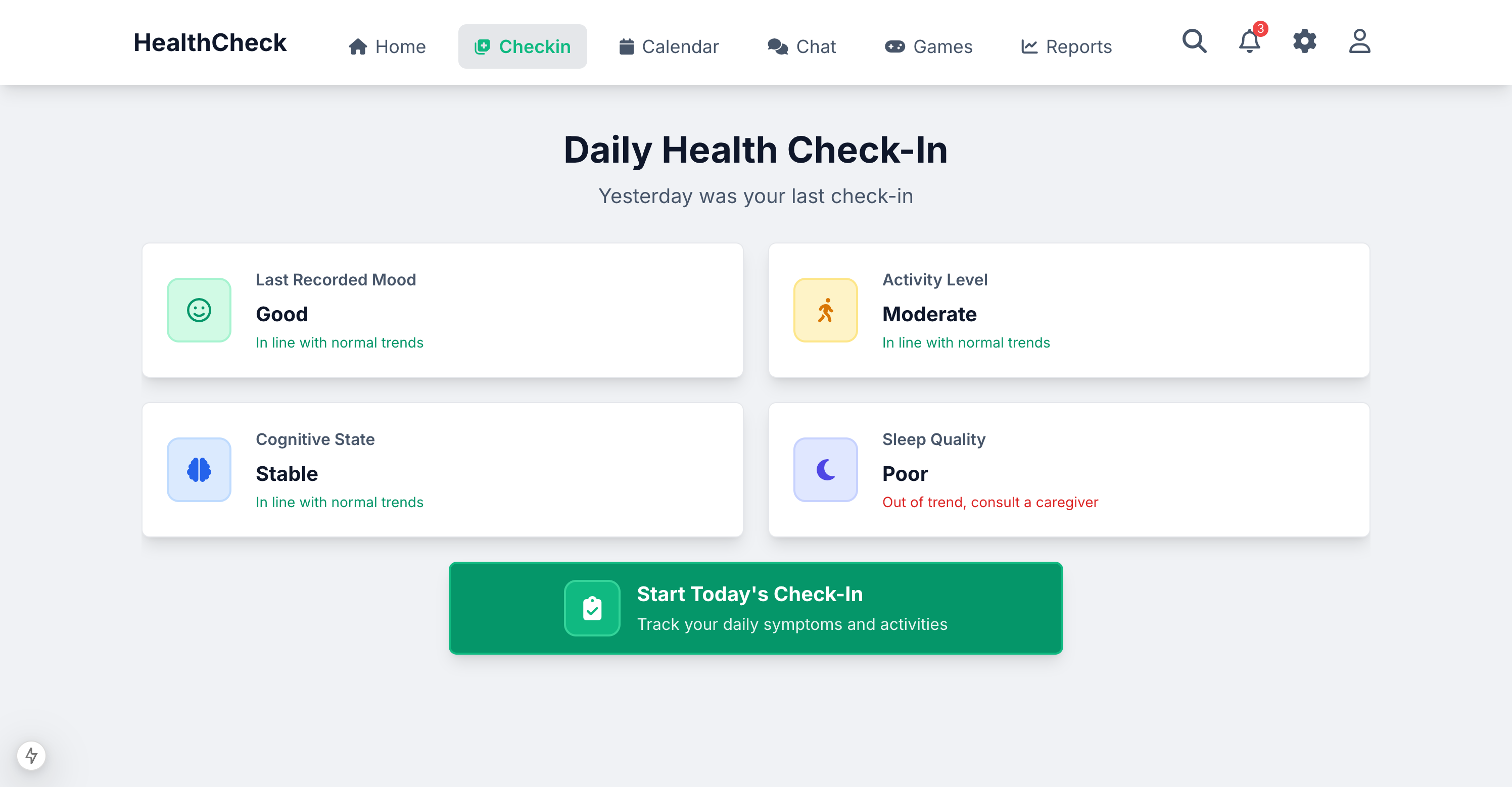
Check-ins designed for memory challenges
Instead of forcing users to remember yesterday's mood, we show them their previous status first. This creates context and reduces the cognitive load of self-reflection.
The large green "Start Today's Check-In" button uses color, size, and iconography to communicate the primary action — no hunting through menus or unclear navigation.
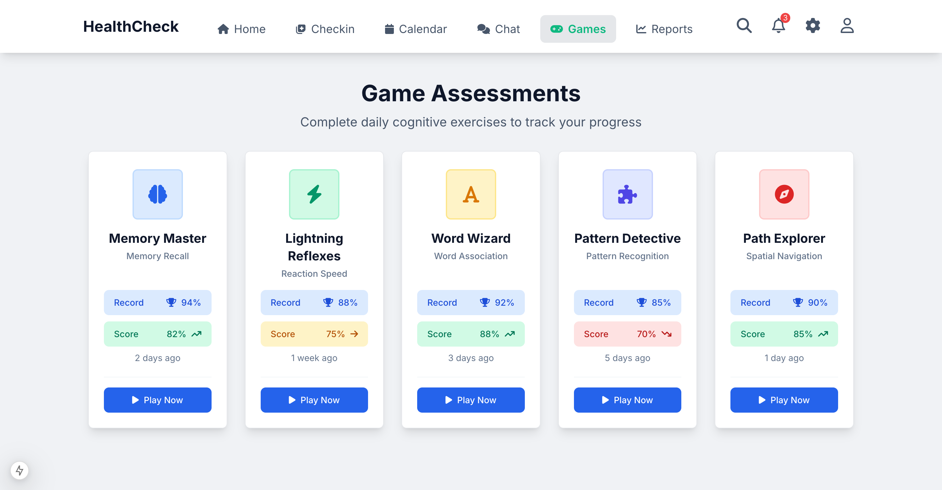
Cognitive exercises that feel like games
Each assessment is presented as a colorful, approachable game rather than a clinical test. Users see their progress (scores) alongside their personal record, creating motivation without pressure.
The consistent "Play Now" buttons and color-coded performance indicators (green for good, amber for attention) help users understand their cognitive health trends at a glance.
What Makes HealthCheck Different
Three design principles that put people first.
Cognitive-First Design
Every interface element reduces mental fatigue. Card-based layouts and clear visual hierarchy help users focus on what matters.
Multi-Stakeholder Platform
One unified system for patients, caregivers, and providers. Role-based interfaces that adapt to each user's needs and responsibilities.
Accessibility Excellence
WCAG AAA compliance that goes beyond checkboxes. Large touch targets, high contrast, and screen reader optimization built in.
Transforming Lives Through Design
Beyond metrics: How cognitive-first design creates dignity, independence, and better health outcomes for people living with cognitive challenges.
Real People, Real Impact
For the first time in months, I feel capable again. I don't need to ask my daughter for help with every little health task. The app makes me feel smart, not stupid.
The Patient
Margaret S.
The Caregiver
Sarah M.
I can finally sleep at night knowing Mom is managing her health safely. The app gives me visibility without making her feel watched. It preserves her independence while keeping me informed.
Instead of guessing about patient compliance, I now have reliable daily data. I can adjust treatments before problems escalate. My patients are healthier and more engaged in their care.
The Doctor
Dr. James Chen